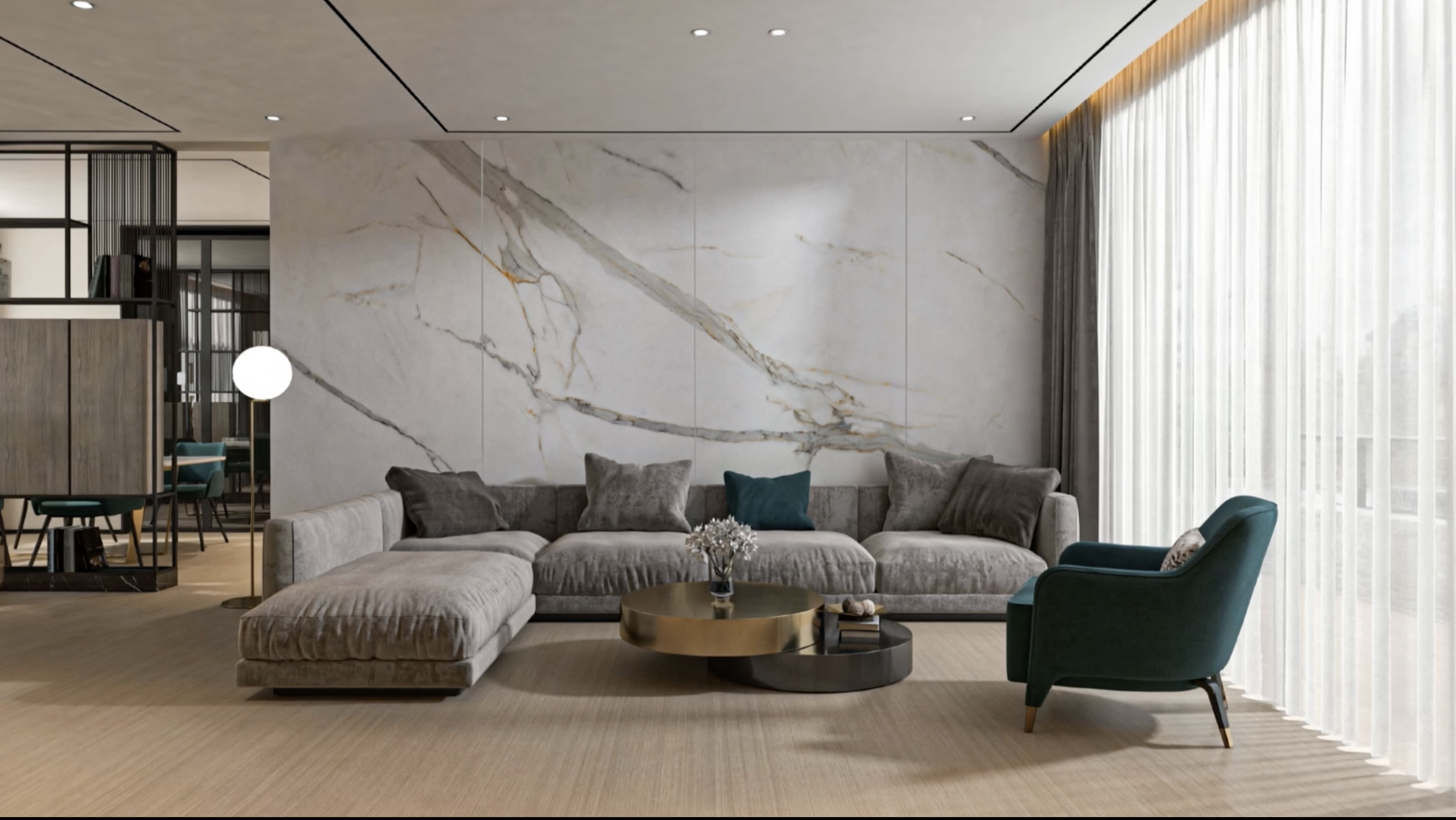
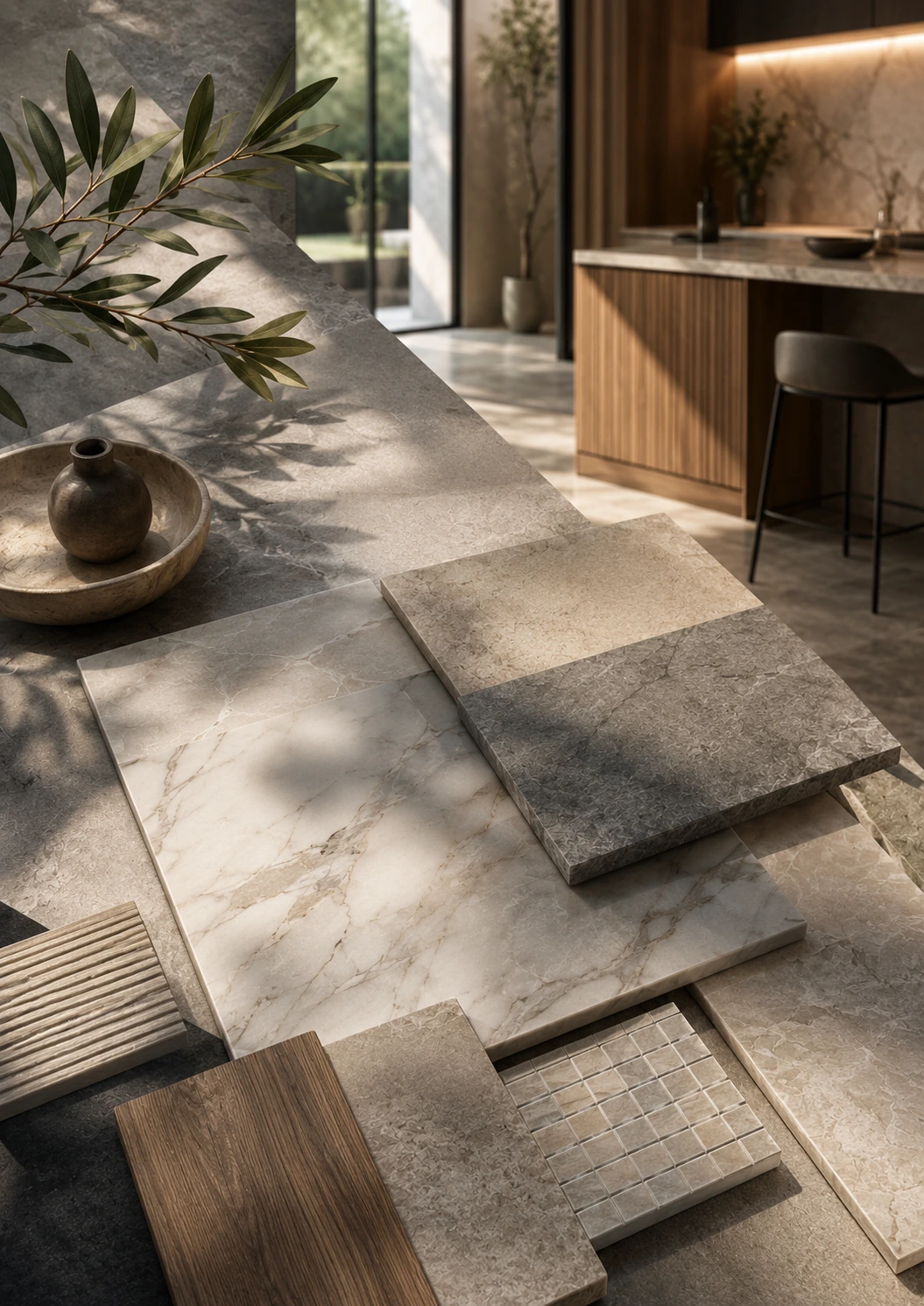
There is no single "best" tile — only the right tile for a given room's traffic, moisture and light. As a starting principle: porcelain for floors, wet areas and anything exterior; glazed ceramic for walls that carry no foot traffic; a textured or matt finish with a Dynamic Coefficient of Friction (DCOF) of 0.42 or higher wherever a floor gets wet; and large-format tile, generally 60x60cm or above, wherever the goal is a calm, uninterrupted surface. Everything below explains the reasoning room by room, so the choice can be made with confidence rather than guesswork.
A decision made in an afternoon, lived with for decades.
Most finishes in a home are replaced within a design cycle — paint every few years, furniture as taste evolves. Tile is different. Once it is set in mortar and grouted, a floor or wall is, in practical terms, permanent. The cost of correcting a wrong choice is not the price of the tile; it is the price of demolition, disposal, and reinstallation, multiplied by the disruption of doing it in a finished space.
That permanence is exactly why tile selection deserves more thought than it usually receives. A tile chosen purely on colour, without regard for where it will sit, how much moisture it will meet, or how many feet will cross it each day, tends to reveal its shortcomings within a year or two — a kitchen floor that scratches, a bathroom floor that turns dangerous when wet, a terrace that fades and stains through its first summer. None of these are the tile's fault so much as a mismatch between the material and the room.
Choosing a tile is really two decisions made at once: how it should look, and what it needs to survive. The second decision should come first — it narrows the field to the options that will still look good in ten years, at which point choosing on appearance becomes safe.
Read the room before reading the sample.
Before comparing finishes or colours, a room can be assessed against four simple questions, and the answers do most of the selection work before a single sample is picked up.
How much traffic will it carry?
A guest bedroom and a hallway are both "floors," but one is crossed a handful of times a day and the other constantly, by feet, luggage, and furniture. Traffic level determines how much abrasion resistance and impact resistance a surface genuinely needs — over-specifying costs money for no benefit; under-specifying shows wear within a year.
How much moisture will it meet?
Splashback moisture, standing water, and direct weather are three different exposure levels, and each calls for a different water-absorption threshold. This single factor is the clearest dividing line between where ceramic remains appropriate and where porcelain becomes necessary — covered in full in Chapter 6.
What is the light doing?
North-facing rooms, spaces lit mostly by warm artificial light, and rooms that get hours of direct sun each read the same tile sample differently. A colour and finish chosen under one light condition can look wrong under another — Chapter 8 explains how to test for this before committing.
What scale is the room working with?
Tile format interacts with room size, ceiling height, and the number of fixed obstacles (islands, vanities, door thresholds) a layout has to work around. A format that reads as elegant in a large open-plan space can generate excessive cutting and waste in a small, broken-up one.
These four questions recur throughout this guide because they are the actual inputs to every recommendation that follows — the room-by-room guidance in Chapters 3 to 5 is simply these four questions answered in advance for the most common spaces in a project.
The rooms where comfort leads.
Living rooms
A living room sees moderate, steady traffic and almost no direct moisture, which frees the decision from most technical constraints and leaves it genuinely open to aesthetics. Large-format porcelain, generally 60x60cm or above, is the standard recommendation: it minimises grout lines across an open floor, reads as a single calm surface, and holds up to furniture, pets, and daily life without special care. A matt or lightly textured finish is usually preferable to a full polish underfoot — it is more forgiving of dust and small scratches and does not show every footprint the way a high-gloss surface does.
Bedrooms
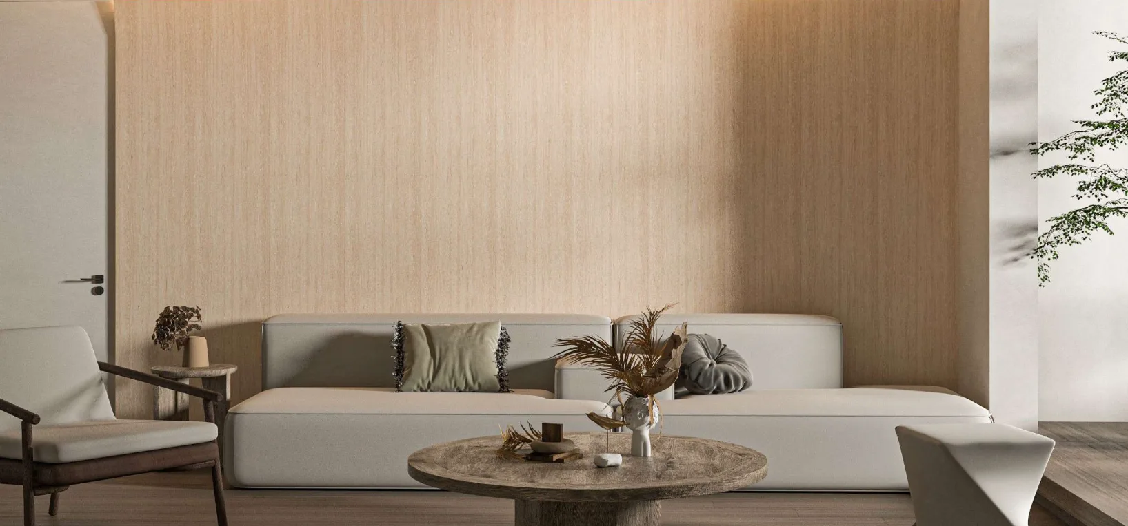
Bedrooms carry the lightest traffic of any room in a home, which means the deciding factors are comfort rather than durability: how the floor feels underfoot first thing in the morning, and how it sounds. Tile stays notably cooler than soft flooring in a warm climate and does not hold dust or allergens the way carpet can, which is why it has become a common bedroom choice in the region even though carpet remains the softer option underfoot. Where tile is used, a warmer colour tone and a honed or matt finish generally suit a bedroom's mood better than the cool sheen of a polished floor, and a same-tile transition into an ensuite bathroom keeps the two spaces reading as one.
Function-first rooms, where the wrong tile shows fastest.
Kitchens
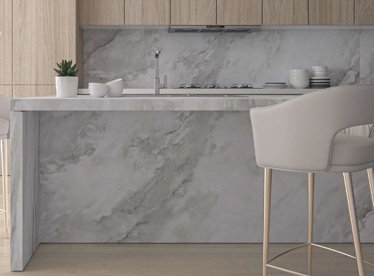
A kitchen floor combines heavy daily traffic with a real risk of spilled liquids, dropped grease, and dragged furniture — the most demanding combination a residential floor typically faces. Porcelain is the standard recommendation, in a matt, textured, or lightly structured finish rather than a polish, since a wet or greasy kitchen floor with a high-gloss finish becomes noticeably more slippery than the same floor in a matt finish. For countertops and full-height splashbacks, large-format porcelain slabs have become the leading alternative to natural stone, offering comparable visual continuity with lower long-term maintenance.
Bathrooms
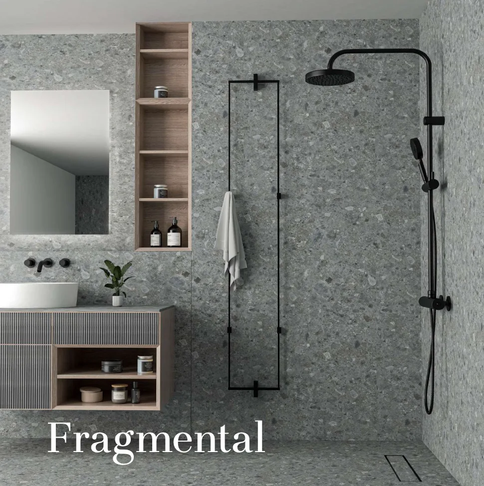
The most considered bathrooms use two materials deliberately: a slip-rated porcelain floor, where water and bare feet meet daily, and glazed ceramic or porcelain walls, where the lighter body and wider range of finishes of ceramic can be used freely without any load-bearing or slip concern. Floor tile in a bathroom should carry a genuine slip-resistance rating rather than being chosen on appearance alone — the full standard is covered in Chapter 7. Larger-format tile on shower walls also means fewer grout lines to maintain in a space that stays damp longer than any other room in the home.
Porcelain floor, ceramic or porcelain walls is the most common professional specification for both kitchens and bathrooms — it puts the more expensive, higher-performance material only where performance is actually tested, and the more economical material where it is not.
Where the margin for error disappears.
Outdoor areas
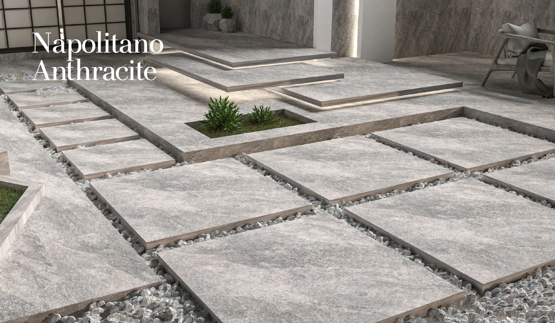
Exterior tile faces direct sun, temperature swings, occasional heavy rain, and in coastal locations, airborne salt — conditions that a porous or unrated tile simply cannot survive long-term. Porcelain rated for exterior use, typically 20mm (2cm) thick and installed as a paver on raised pedestals or a mortar bed, is the standard for terraces, pool decks, and walkways. The finish should be textured or structured rather than polished, both for slip resistance underfoot when wet and because a matt surface hides dust and mineral deposits far better than a gloss one does over time outdoors.
Commercial spaces & high-traffic environments
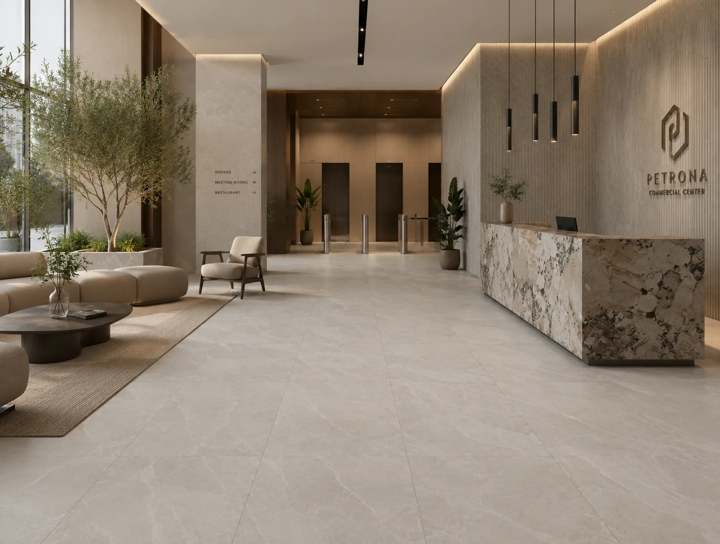
Lobbies, retail floors, corridors, and hospitality spaces are assessed against an abrasion resistance scale, PEI (Porcelain Enamel Institute) Class I to V, which rates a glaze's resistance to surface wear under foot traffic. Class III suits light residential and light commercial use; Class IV and V are specified for heavy commercial and public floors, where continuous foot traffic — often in outdoor shoes carrying grit — would visibly dull a lower-rated glaze within a year or two. Breaking strength and deep abrasion resistance, both defined under ISO 10545, are the other two figures a commercial specification should confirm alongside PEI class.
A tile that performs beautifully in a private villa can wear visibly within months on a hotel lobby floor, purely because of traffic volume rather than any fault in the material — commercial specification is a genuinely different exercise from residential selection, not a stricter version of the same one.
The one number that decides the most.
Every porcelain tile is a ceramic tile, but not every ceramic tile qualifies as porcelain — the distinction rests on a single, standards-defined figure. Under ISO 13006 (Group BIa) and ANSI A137.1, a tile may be classed as porcelain only if it absorbs 0.5 per cent or less of its weight in water, tested per ASTM C373 or ISO 10545-3. That low absorption is the product of a denser raw material, higher pressing pressure, and a hotter firing temperature — typically 1,200–1,400°C, against roughly 1,000–1,150°C for standard ceramic — and it is what gives porcelain its strength, stain resistance, and suitability for wet areas and exteriors.
None of this makes ceramic an inferior material; it makes it a different tool. Ceramic is lighter, easier to cut, and more economical, which is exactly why it remains the right choice for walls that carry no foot traffic and meet no standing water — a kitchen splashback or a feature wall gains nothing from porcelain's extra density. We covered this comparison in full technical depth in an earlier edition: Porcelain vs Ceramic: What's the Difference — and Which Should You Choose?
“Choose ceramic for what the eye touches. Choose porcelain for what life touches.”The Petrona Rule of Thumb
The finish decides how a floor behaves, not just how it looks.
Polished, matt, textured, and lappato (semi-polished) are the four finishes most tile ranges offer, and the difference between them is not purely visual. Polished finishes reflect the most light and read as the most formal, but they lose most of their grip the moment they get wet — which is why a polished finish belongs indoors, away from bathrooms, kitchens, and any exterior surface. Matt and textured finishes sacrifice some shine for genuine slip resistance, and structured or anti-slip finishes go further still, designed specifically for pool decks, ramps, and heavily wet commercial floors.
The technical measure behind this is the Dynamic Coefficient of Friction (DCOF), tested under ANSI A137.1 / A326.3. For any floor that will be walked on when wet — bathrooms, kitchens, terraces, pool surrounds — a DCOF of 0.42 or higher is the widely referenced minimum benchmark. It is a genuine safety specification, not a marketing detail, and a credible supplier should be able to provide it on request for any tile intended for a wet-walkable floor.
Wet-Walkable Floors · ANSI A137.1 / A326.3
ISO 13006 Group BIa
Three decisions that change how a room feels.
Format & scale
Large-format tile, generally 60x60cm and above, reduces the number of grout lines crossing a floor, which makes a room read as calmer and larger. Small-format and mosaic tile does the opposite by design, drawing the eye to pattern and texture — better suited to accent walls, shower niches, and areas where a busier surface is genuinely wanted rather than a side effect of an undersized format. As a rule, format should scale with room size: a very large tile in a small, broken-up bathroom generates excessive cutting and waste, while a small tile across a large open floor multiplies grout lines and visual noise.
Colour, considered
Lighter tones make a room feel larger and reflect more light, which suits smaller or darker spaces; darker tones read as warmer and more intimate, and hide dust and minor scuffing better in high-traffic areas. Colour should always be assessed against the room's actual finishes — cabinetry, worktops, existing stone — rather than in isolation, since undertones that look neutral alone can clash once placed beside another material.
How light changes a tile
A tile sample almost never looks the same in a showroom as it will in the finished room, because lighting temperature and direction change how colour and texture read. Warm artificial light shifts cool greys warmer; north-facing rooms read cooler than the same tile under direct sun. The only reliable way to confirm a colour choice is to view a full-size sample in the actual room, at the time of day it will most often be seen, before ordering the full quantity.
Never approve a tile colour from a single showroom sample under a single light source — bring the sample home, or bring the room's own light into the showroom conversation, before committing.
The detail that's easy to underestimate.
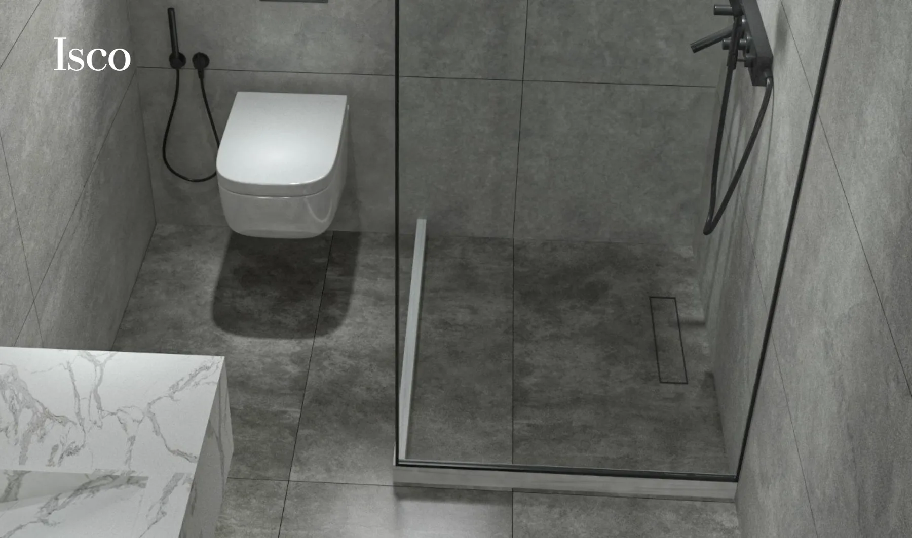
Grout colour has an outsized effect on how a finished floor reads, because it is the one element repeated across the entire surface. A grout close in tone to the tile minimises the visible grid and lets a large-format floor read as one continuous surface — the usual choice for living areas and any room where a calm, uninterrupted look is the goal. A contrasting grout does the opposite on purpose, framing each tile and drawing attention to the pattern or joint layout, which suits smaller-format tile, mosaics, and patterned installations where the grid is part of the design rather than something to hide.
Beyond colour, the practical choice is between cement-based and epoxy grout. Epoxy grout is denser, effectively non-porous, and highly stain- and chemical-resistant, making it the stronger choice for kitchen floors, commercial floors, and any wet area where hygiene matters — at a higher material and installation cost than standard cement-based grout, which remains perfectly adequate for lower-moisture residential areas like living rooms and bedrooms.
Porcelain & ceramic, compared
A quick reference for how the two materials compare across the criteria covered in this guide. Natural-stone-look and wood-look porcelain share every figure in the porcelain column — the surface pattern changes, the underlying body doesn't.
What ongoing care actually looks like.
Porcelain's low porosity makes it the lowest-maintenance option in this guide: regular sweeping and a pH-neutral cleaner are generally sufficient, with no sealing required over the tile's lifetime. Glazed ceramic is similarly straightforward, provided the glaze remains intact — a chip that exposes the clay body beneath should be addressed, since the exposed body is more absorbent than the glazed surface around it. Grout is usually the maintenance variable that matters most in practice: cement-based grout benefits from periodic sealing to resist staining, while epoxy grout, once installed, needs little beyond routine cleaning.
Textured and structured finishes, chosen for their slip resistance, do require slightly more attention when cleaning than a smooth polished surface, since their texture can hold dust and grime a flat surface would release more easily — a reasonable trade for the safety they provide in wet areas, and not a reason to choose a smoother finish where slip resistance is the priority.
Where most tile decisions go wrong
-
Choosing colour under showroom lighting only
Showroom lighting is chosen to flatter every tile equally, which is exactly why it cannot be trusted to predict how a colour will read in a specific room. Always view a sample in the room's own light before ordering.
-
Ignoring slip resistance for wet floors
A beautiful polished tile in a bathroom or on a pool deck is a genuine safety hazard once wet. Slip resistance should be confirmed with a DCOF figure, not assumed from how grippy a dry sample feels underfoot.
-
Using standard ceramic outdoors
Ceramic's higher water absorption cannot survive UAE sun, heat cycling, and — in coastal locations — airborne salt. Exterior surfaces need a tile genuinely rated for exterior use, not simply a tile that happens to be waterproofed with a sealant.
-
Skipping the water-absorption spec sheet
Water absorption, tested to ISO 10545-3 or ASTM C373, is the single figure that predicts more about a tile's real-world performance than any other. A supplier who cannot produce it for a given product is a reason to keep looking.
-
Underestimating grout's visual impact
Grout colour is chosen last far too often, after the tile itself is already ordered — yet it changes how the finished floor reads more than almost any other decision in the room. Decide tile and grout together, not in sequence.
Our guidance, project by project
Matt or lightly textured finish, 60x60cm or above, to keep an open floor calm and low-maintenance.
A warmer tone and honed or matt finish generally suit a bedroom's mood better than high gloss.
Non-negotiable for floors, given spill and impact exposure. Large-format slabs suit worktops and splashbacks.
Pair with glazed ceramic or porcelain walls. Slip rating is the one figure not to compromise on.
Textured or structured finish only. Confirm the exterior rating before ordering, not after installation.
Specify abrasion class and breaking strength alongside water absorption for any high-footfall floor.
The final checklist, before you order
Nine questions worth answering before any tile is purchased — most of them covered in this guide, gathered here in one place.
- Does the water absorption rating match the room's moisture exposure (ISO 10545-3 / ASTM C373)?
- Is the slip-resistance rating (DCOF) confirmed for any floor that will get wet?
- Is the tile explicitly rated for exterior use, if it will be used outdoors?
- Does the abrasion class (PEI) suit the expected foot traffic, especially in commercial settings?
- Has a full-size sample been viewed in the actual room, at the time of day it will most be seen?
- Does the tile format suit the room's scale, avoiding excessive cutting or excessive grout lines?
- Has grout colour and type (cement-based vs epoxy) been chosen alongside the tile, not after?
- Is the quantity ordered enough to cover cutting waste plus a spare box for future repairs, from the same batch?
- Has an installer with experience in the chosen format and finish been confirmed, particularly for large-format tile?
Choosing the right tile for a space is ultimately an exercise in matching a surface's real physical properties — water absorption, slip resistance, format, and finish — to what that specific room actually demands of it, before appearance enters the decision. Petrona's own range spans porcelain tiles, large-format slabs, and outdoor porcelain selected against exactly these criteria, and our showroom team is glad to walk through the right choice for a specific room, project, or budget. For this same room-by-room approach applied specifically to a villa — including the travertine-look porcelain now trending across UAE villa specifications — see Best Porcelain Tiles for Villas in the UAE.
- ISO 13006 — Ceramic tiles: Definitions, classification, characteristics and marking. International Organization for Standardization. Group BIa defines porcelain (dry-pressed, water absorption ≤0.5%).
- ANSI A137.1 / A326.3 — American National Standard Specifications for Ceramic Tile and companion DCOF test standard. Tile Council of North America. Defines the porcelain water-absorption threshold and the 0.42 minimum DCOF benchmark for wet-walkable floors.
- ISO 10545 series — Ceramic tiles: Test methods, including Part 3 (water absorption), Part 4 (breaking strength) and Parts 6–7 (abrasion resistance).
- ASTM C373 — Standard Test Methods for Determination of Water Absorption and Associated Properties of Ceramic Tile. ASTM International.
- PEI (Porcelain Enamel Institute) — Surface Abrasion Resistance Classification, Class I–V, for glazed tile.
General guidance only. Project-specific installation and structural requirements should be confirmed with a qualified consultant or installer.
Frequently asked questions
What is the best tile for a living room floor?
Large-format porcelain, 60x60cm or above, in a matt or lightly textured finish. It minimises grout lines, resists daily wear from furniture and foot traffic, and is available in the widest range of colours and effects.
Should bedroom floors use tile or another flooring material?
Tile is a valid choice, especially in a warm climate — it stays cool underfoot and doesn't trap dust the way soft flooring can. A warmer tone and matt or honed finish generally suit a bedroom better than a high-gloss polish.
What is the best tile for a kitchen floor?
Matt or textured porcelain. Kitchens combine heavy traffic with spill risk, both of which call for a dense, low-absorption, slip-resistant surface — a polished finish is best avoided specifically because it becomes more slippery once wet.
What slip resistance rating do bathroom floor tiles need?
A DCOF of at least 0.42 under ANSI A137.1 / A326.3 is the widely referenced benchmark for a wet-walkable floor. Textured or matt finishes reliably meet it; polished finishes generally do not once wet.
Can the same tile be used indoors and outdoors?
Only if it's explicitly rated for exterior use. Many collections offer a matching 9–10mm indoor tile and a 20mm outdoor paver in the same colourway, giving visual continuity with the correct thickness and rating for each setting.
What is the difference between porcelain and ceramic tile for home use?
Porcelain is denser, with water absorption of 0.5% or less (ISO 13006), making it the stronger choice for floors, wet areas and exteriors. Glazed ceramic remains excellent, more economical value for walls with no foot traffic.
What size tile makes a small room look bigger?
Larger formats, generally 60x60cm and above, tend to make a small room read as more spacious, since fewer grout lines interrupt the eye. Running the same tile into an adjoining room reinforces the effect.
How much should grout colour match or contrast the tile?
A close match minimises the visible grid, best for large-format tile and a calm, continuous look. A contrasting grout draws attention to the pattern deliberately, and suits smaller-format or mosaic tile.